Thought I would show some samples from last semesters sketchbook, as it seems that my focus will be on digital drawing and concept sketches for the forseeable future, and less on traditional still life and other drawing. While in this case we were required to focus on quick sketches, it is the the detailed illustrations that I enjoy doing the most, as it allows me to get lost in the drawing and really focus on the detail.
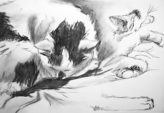 |
| My cat Indy, with charcoal, details in pen. |
For many of these sketches I chose charcoal and chalk pastels, as ot only are these mediums I need practise in, but they also forced me to work quickly, as this is what they are best suited for.
For animals in particular who are constantly moving, getting a quick charcoal sketch is very useful.
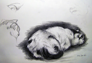 |
| Indy again, this time with pencil. | |
|
|
After animal studies I decided to focus on the human body, in particular hands and feet, which are notoriously difficult and which I needed practice on.
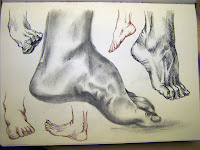 |
| I loved the effect that fine line pens had in showing the tendons of the feet |
While I worked from observation and from my own feet, these sketches are from drawings in a book, as it seemed the easiest way to teach myself directly about the structure and flexibility of feet without worrying about the difficulty of drawing from life.
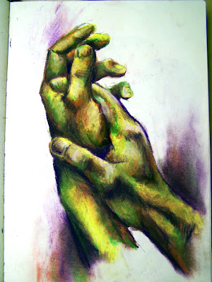
These hands were more an experiment with colour than anything. I used the method of switching between the same 4 colour every 10 seconds, only building the form of the hands after I had got the basic colours on.
This is an interesting way of working, and helpful im making me loosen up as normally my drawing is very tight and conrolled. In the original there is more red and green visible than seen here, though that is just the quality of the upload.
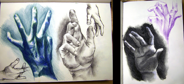 |
| With these hands I was experimenting with the strengths of the different materials used, emphasising the form, movement and folds of the hands, and also with light and shade. |
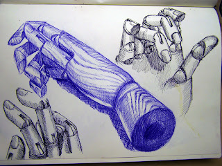 |
| Hand manikin, in blue biro and black fine liner |
I found this hand manikin, intended to help artists draw the hand, was a good way of combining my interest in hand joints with the details of drawing woodgrain, and smooth man made objects. In this way it is a mixture of natural and artificial elements, which interests me.
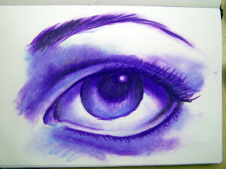 |
| As I used blue and purple chalk pastel, I had to sacrifice detail for tone | |
|
|
|
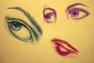
I also enjoy working on eyes, as I feel that in portraits in particular these the most important part - the window to the soul. If there is something wrong with the eyes, the whole picture will look wrong.
However unlike most other features such as hands, it is often very difficult to tell what is wrong with an eye, it could be the angle, the size of the pupils or a subtle difference in the highlights.
The only way I can really get used to seeing this is with practice, focusing particularly on the detailed folds around the eyes, and on drawing from unusual angles.


 In doing this I can see possibilities for the letters, in particular the Z. Other letters where they were found in markings on the ground are also interesting, especially when the detail is can be seen even in the shadow. this means that even though the letter forms are more clearly visible, there are still touches that make them stand out from other fonts and lettering that can be found.
 This exercise used some more techniques that are new to me, that will be very useful in the future. For the brick I used exact measurements that linked with the programs grid, making the drawing and measuring of the object that much easier.
 Colour pencil detail of folds in clothes, using several shades of brown and yellow to add greater depth to the image. I love this way of working, as blending several tones together like that is a simple way of really bringing a picture to life, while essentially keeping the same method of working as before.


 While I worked from observation and from my own feet, these sketches are from drawings in a book, as it seemed the easiest way to teach myself directly about the structure and flexibility of feet without worrying about the difficulty of drawing from life.


 Still messing around with the features of 3D max, this time using control points to manipulate a box into a unique shape. More a chance to get used to the controls and possiblilities than a serious attempt at creating an object, here are a few random stages from along the way
 At first the focus was on rounding the object, getting rid of the right angles and any evidence that it was once a box. With the front and sides extended it srted to look like a spaceship, which seems to be the default shape when messing around like this - everything ends up looking like a shaceship.